Hilliard Food Pantry Plus
A renewed identity inspiring connection and growth
Hilliard Food Pantry Plus (HFP+) is a community organization providing food assistance, education, and support services to families in the Hilliard area. As their services expanded beyond food distribution, the existing brand no longer reflected the full scope of their impact.
I supported the development of a new identity that better represents HFP+ as a holistic, welcoming support system while maintaining a strong connection to the local community.
Role: Brand Designer
Scope: Identity design, collateral rollout
Collaboration: Worked under creative direction to execute and extend the brand
Focus: Translating strategy into a clear, cohesive visual identity
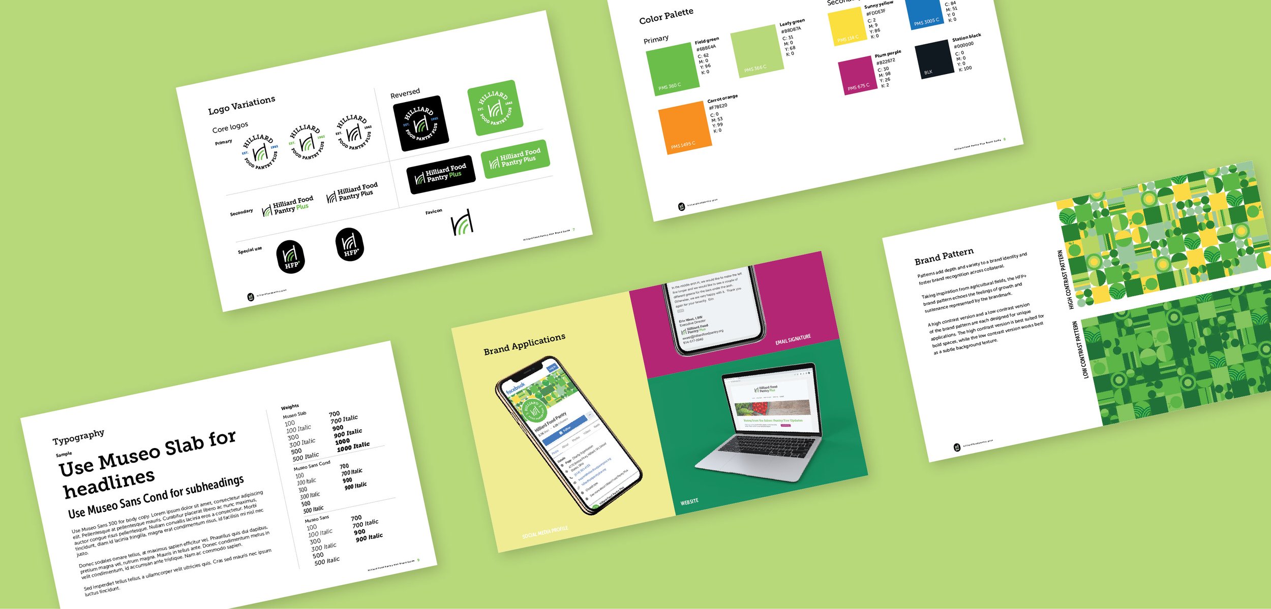
Identity System
The existing brand narrowly framed HFP+ as a food pantry, limiting their ability to communicate the full scope of services they provide. The new identity needed to honor the organization’s deep roots in Hilliard while positioning it as a holistic hub of support.
Working under creative direction, I supported the development of a new identity that repositions HFP+ as a broader, more holistic community resource while maintaining a strong connection to its local roots. I focused on translating the established brand strategy into a clear, cohesive visual system that could scale across touchpoints.
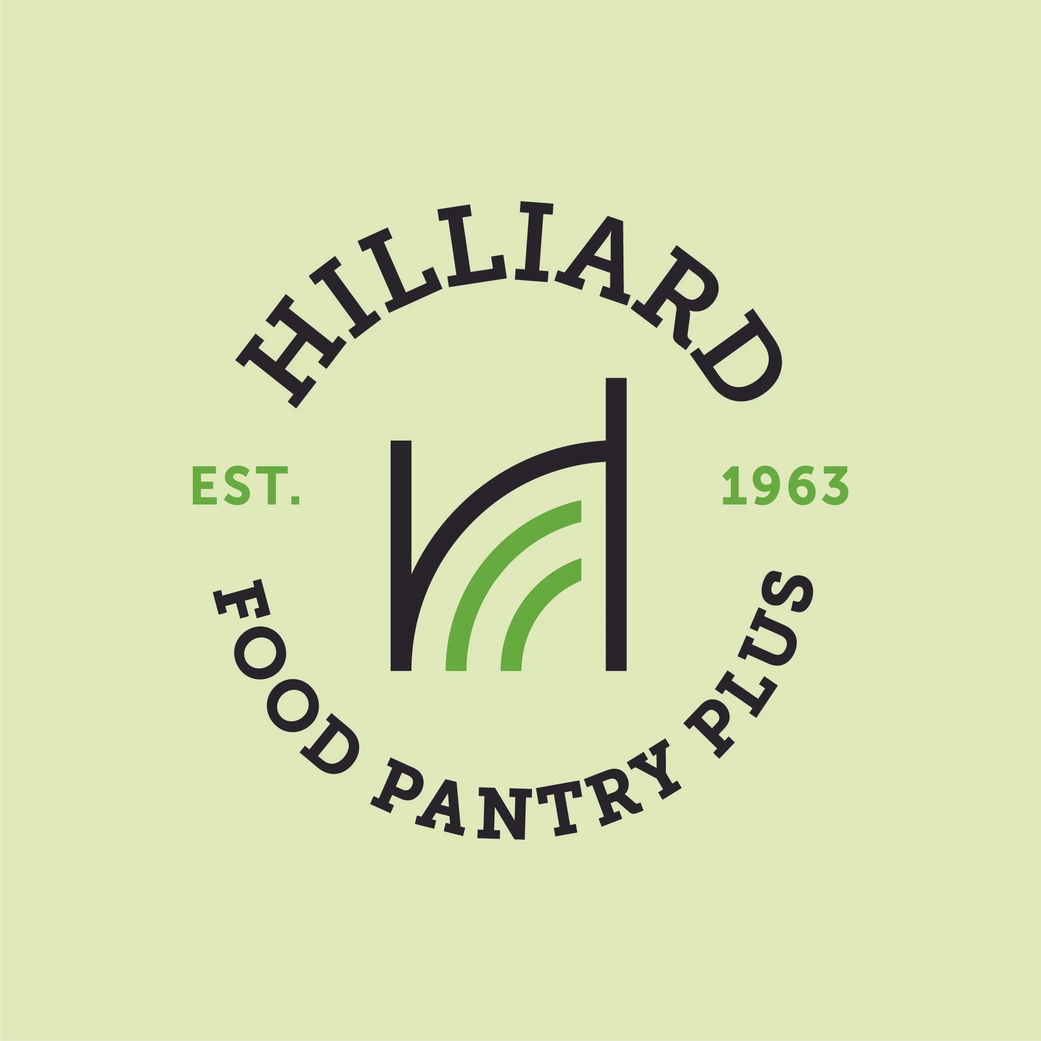
The identity moves away from literal food imagery to better reflect the organization’s expanded mission. The brandmark draws from the historic arch in Old Hilliard, grounding the identity in a recognizable local reference, while supporting geometric forms suggest ideas of growth, stability, and connection.
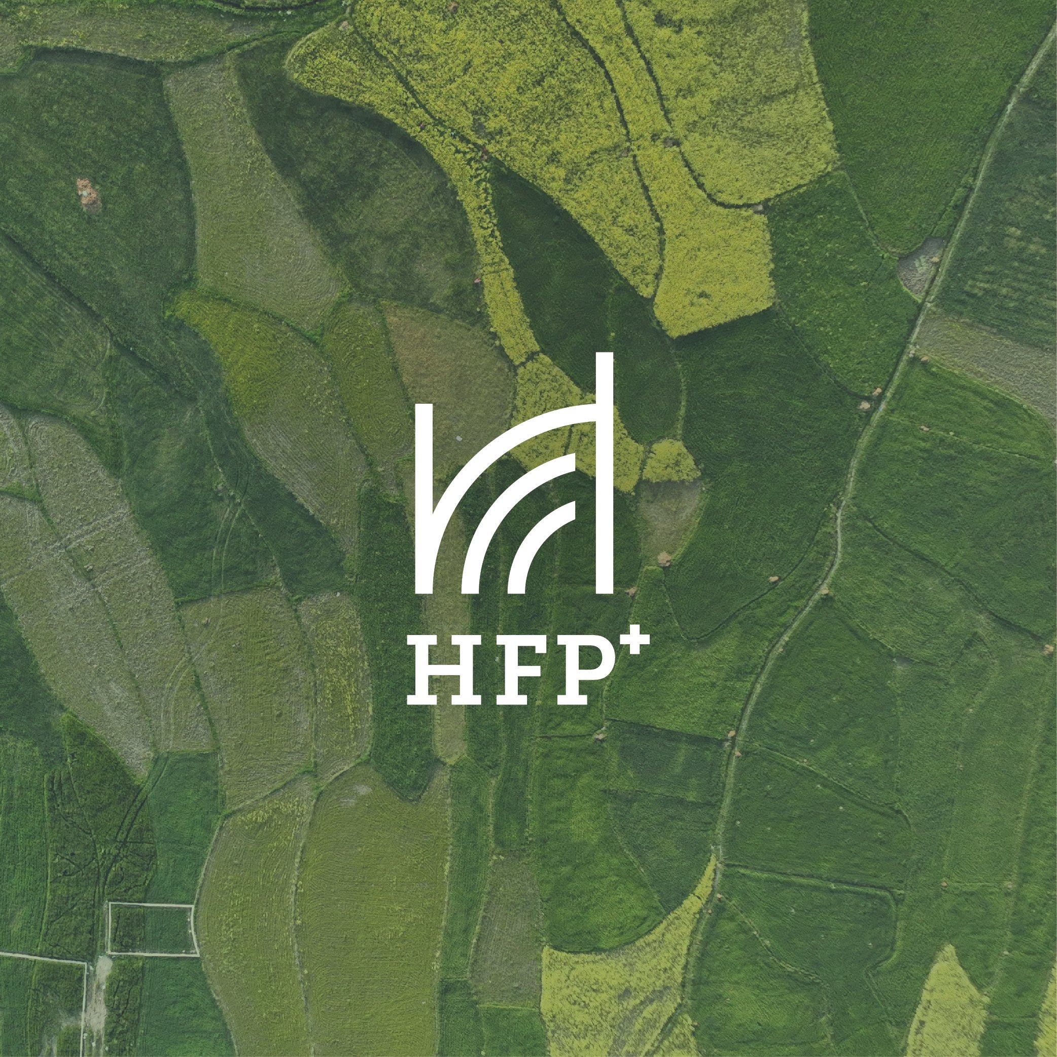
A brand pattern, inspired by agricultural fields seen from a bird’s eye view, adds depth and texture to the HFP+ identity. These minimal geometric shapes take on more meaning as they relate visually to the arches and rectangles in the brandmark, and they communicate key ideas of growth and sustenance represented by the brandmark as well. This visual and conceptual connection to the brandmark makes these shapes feel ownable to the pantry.

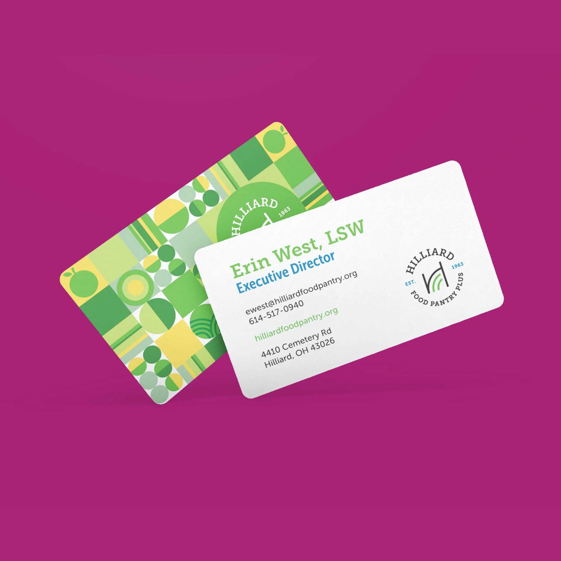
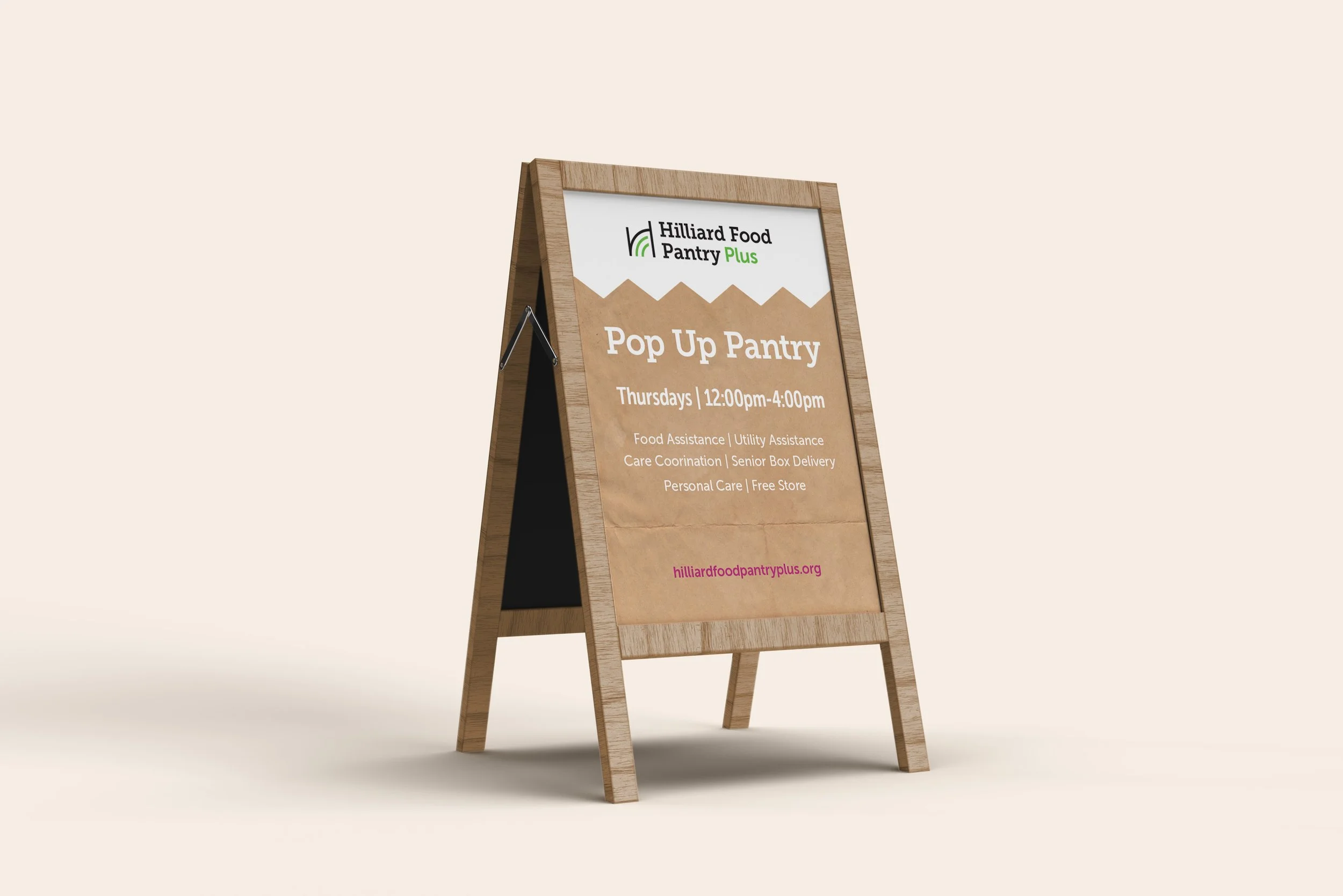
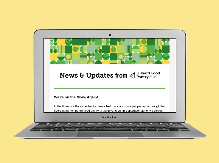
Collateral Kit
As part of the rollout, I led the design of a print and digital collateral system to help help HFP+ communicate with families, donors, and volunteers.
These materials prioritize clarity, accessibility, and warmth, ensuring information is easy to understand while reinforcing the organization’s mission and tone.


Results
The refreshed identity gives HFP+ a more flexible and accurate way to represent their work, supporting clearer communication and stronger recognition within the community.