Hilliard Food Pantry Plus
A renewed identity inspiring connection and growth
Hilliard Food Pantry Plus, also known as HFP+, is more than a food pantry (thus the “plus”). They are a conduit in their community, connecting families to resources and education to help them thrive. Formerly known as Hilliard Food Pantry, HFP+ empowers their community through classes, utility assistance, transportation, food assistance, and connection to a network of support.
A new identity encompasses the wide range of services offered by HFP+ and speaks to Hilliard’s history and sense of place.
Identity System
The existing brand narrowly framed HFP+ as a food pantry, limiting their ability to communicate the full scope of services they provide. The new identity needed to honor the organization’s deep roots in Hilliard while positioning it as a holistic hub of support.
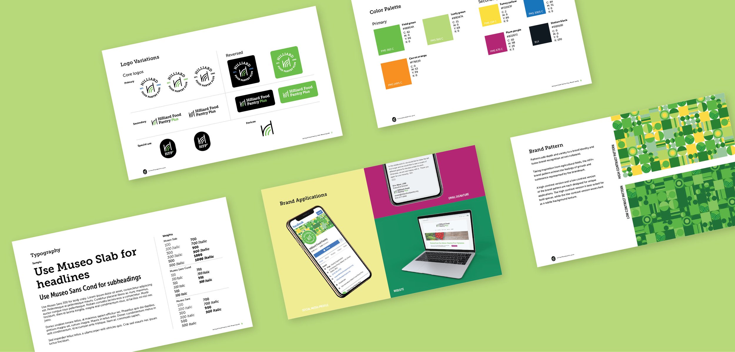
To avoid defining HFP+ as only a food pantry, their identity mostly steers clear of food iconography. The brandmark is anchored by a black arch, alluding to the Hilliard’s station arch in Old Hilliard. The black arch is supported by two concentric green arches, suggesting ideas of rolling hills, agriculture, and sustenance.
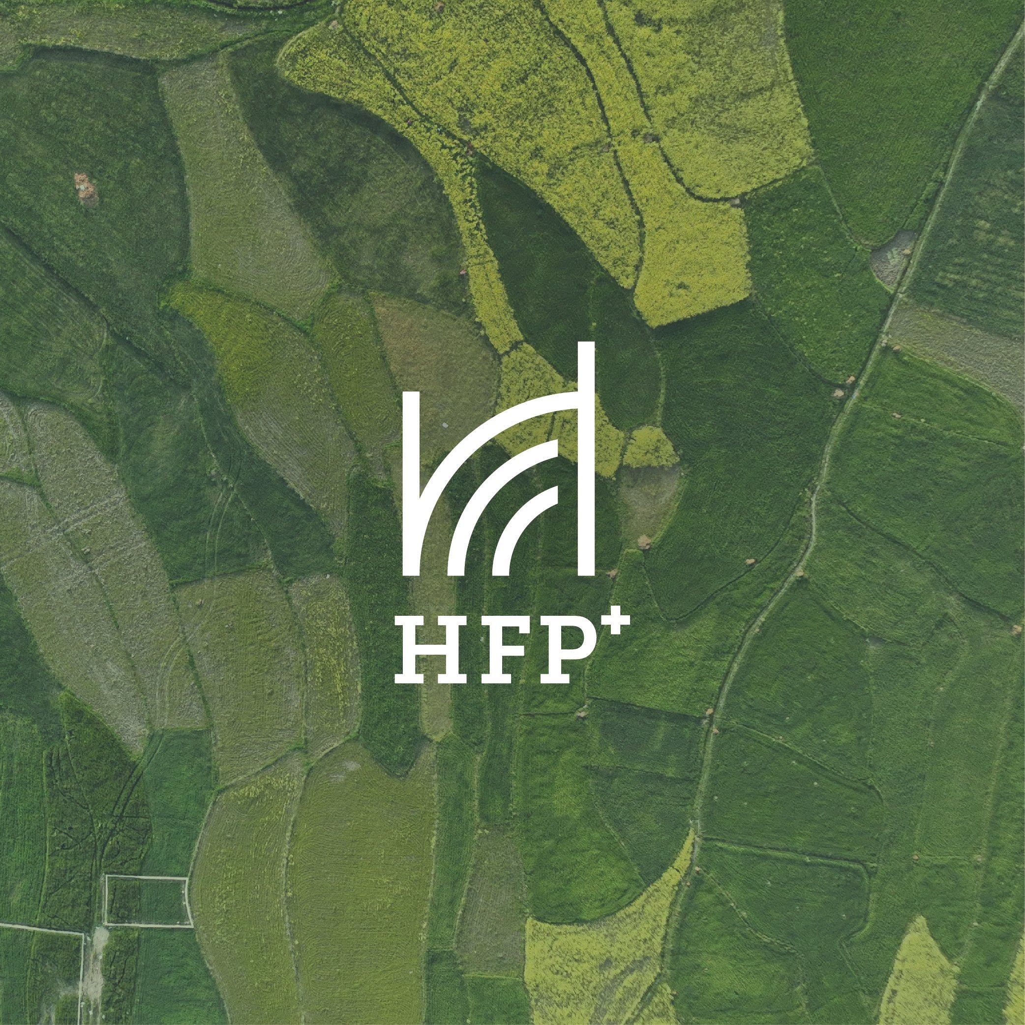
A brand pattern, inspired by agricultural fields seen from a bird’s eye view, adds depth and texture to the HFP+ identity. These minimal geometric shapes take on more meaning as they relate visually to the arches and rectangles in the brandmark, and they communicate key ideas of growth and sustenance represented by the brandmark as well. This visual and conceptual connection to the brandmark makes these shapes feel ownable to the pantry.

Collateral Kit
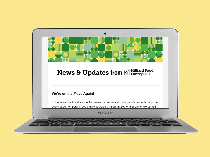
As part of the rollout, I led the design of a print and digital collateral system to help HFP+ communicate effectively with its key audiences - families, volunteers, and donors.
Updated educational materials direct families, donors, and volunteers to the pantry’s new URL, where they can find information about assistance and ways to get involved. Each touchpoint is friendly, clear, and empowering, mirroring the organization’s mission.


Results
With a refreshed identity, HFP+ hopes to achieve increased awareness in their community, opening opportunities to connect with new donors and volunteers alike, thus expanding their ability to serve Hilliard families.